One Argument Against the Infographic

DISCLAIMER: I love words and sentences and punctuation and all of that stuff. That is to say that the forthcoming analysis is laced with a healthy dose of bias, a hint of bitterness, and hopefully a little truth.
HUMANS NATURALLY LOVE VISUAL CONTENT
Have you seen this? Have you heard about this? Oh, and there’s this:
- 4X as many consumers would prefer to watch a video about a product than to read about it. (Source)
- When people hear information, they’re likely to remember only 10% of that information three days later. However, if a relevant image is paired with that same information, people retained 65% of the information three days later. (Source)
- Cisco projects that global internet traffic from videos will make up 80% of all internet traffic by 2019. (Source)
After years of covering my eyes and plugging my ears, I admit that visual content is relevant, valuable, and yes, preferred. Those aren’t new arguments for visual content, just really convincing ones.
Content marketers heard those arguments, and after ending our careers in journalism, we acted! We considered costs, measured resources, and dreamed of links! And finally, we seemingly all agreed that our futures would be secured through the production of infographics. Lots and lots of infographics. If you’re not sure, an infographic is “a visual image such as a chart or diagram used to represent information or data”, according to Google. But the word has come to represent these monstrosities, more specifically:
Below is a visual representation of our interest in infographics over the past ten years as measured by Google Trends. I use the visual because the actual stats would be SO BORING.
As you can see, the popularity of infographics really picked up in 2011 and has risen steadily through 2016 before plateauing in 2017. The increase in interest and production was not unfounded. Here are a few reasons why they were/are so popular:
CONSUMERS LOVE VISUALS: See above commentary.
ALL THOSE LINKS: The theory goes that because infographics offer such compelling information and stunning design, they will go viral. Once viral, the infographic will be linked to from other sites – increasing traffic for a site while also gaining authority in the eyes of Google.
SHOWCASES EXPERTISE: Most infographics not only share valuable information, they also attach a business logo and brand to that information. In addition to the authority gained as the researcher, or in many cases, information wrangler, the business gains brand awareness and potential opportunities to promote/sell its services.
A CASE AGAINST THE INFOGRAPHIC
I have a few personal gripes with infographics, but I’ll leave those for later. There’s no need to rant and rave when there are plenty of sensible, objective reasons for never publishing another infographic. Let’s take a look at a few reasons infographics are going the way of The Mooch.

SKETCHY RESEARCH: Infographics are intended to share relevant, interesting, or illuminating information. The audience understands that information to be well-researched or well-sourced. Unfortunately many designers either:
- Don’t do their own research
- Conduct research, but use unreliable, confusing, or misleading data
- Source outdated or irrelevant research
- Create data out of thin air
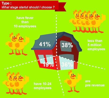
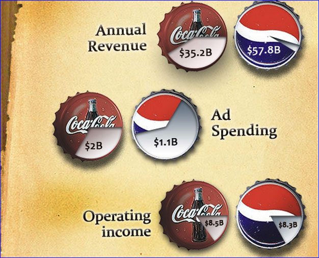
POOR DESIGN: We all aren’t graphic designers, but consumers know a bad graphic when they see it. Maybe it’s the neon green background, confusing barn graph, or simply those cocky chickens – but from the get-go, there’s just something off with this infographic. Many infographics suffer from similar deficiencies. They detract from even the most interesting information – and can tarnish the producing brand’s reputation.
OUTDATED: I’m sure there was a time when infographics carried buzz, spurred conversation, and were even shared and embedded by the world’s most zealous – but those days are gone. That isn’t to say infographics aren’t being produced or don’t have value, but they no longer pack the aesthetic punch they once did. This is especially true as consumers increasingly prefer to use the smaller screens of mobile devices.
I HAVE SOLUTIONS
I promise I’m not here just to hate on infographics. I can hear it now:
“What kind of weirdo writes a 1,000-word hit piece on infographics?”
I hear you, and you’re not wrong. That said, I’m here to offer a few words of advice and a few options when considering your next piece of visual content.
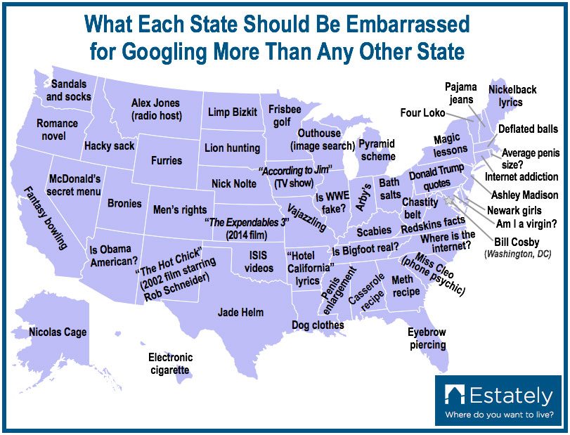
MAPS: One of the most widely shared types of visual content is the map. Maps are commonly used to visually represent anything from common search histories to sports team allegiances to income mobility. They tap into a wide range of emotions including two of the most powerful: humor and pride. That emotional power combined with the versatility of the medium carry the potential to go viral while also distributing meaningful information.
QUIZZES: OK, a quiz isn’t necessarily visual content, but a well-executed quiz should incorporate images in addition to trendy topics like “Which Ousted Arab Spring Ruler Are You?”. Quizzes remain a popular online content form because they’re highly sharable and appeal to our most basic desires to discover and express ourselves. According to research from BuzzSumo, the average online quiz is shared 1,900 times!
GIFS: Pronounce it however you please, but GIFs should be incorporated into any content strategy, especially in coordination with social media. The most common GIFs display an important moment or sequence of events. The moment or event is put on a continuous loop, creating a mesmerizing effect that increases engagement. While those types of GIFs are most popular and valuable for increasing brand awareness, GIFs also can be informational as seen above in an infographic design by Jake O’Neal.
You vs. the guy she tells you not to worry about. pic.twitter.com/k6a5y4a7Od
— Jimmy John’s (@jimmyjohns) August 18, 2016
MEMES: Memes can be risky for brands, but when well-executed, they can extend a brand’s reach as far as any other form of content. With that said, they also have the potential to do damage, whether it’s because the brand whiffs on the joke, the meme is outdated, or the content is insensitive or offensive. If you know your brand voice and target audience, meme away. Just make sure you have a few sets of eyes look at it before hitting send.
IF YOU MUST
Despite my personal preference for text, it’s obvious that visual content, including infographics, is the present and future of content marketing. If you know how and when to use an infographic, they can be an effective part of your content strategy. Here are a few tips if you choose to go that direction:
- Bigger isn’t necessarily better. Design infographics with mobile devices and social media in mind.
- Don’t confuse the consumer. Consumers can be overwhelmed by intricate graphs and charts. Simplicity can still be powerful.
- Draw bold (and accurate, of course) conclusions. The information is nice, but the consumer isn’t there to put all the pieces together. Let them in on the secret, and they’ll be more likely to share or link.
FINAL THOUGHTS
Infographics aren’t inherently bad. They’re a proven source of engagement, links, and even leads. But lately they seem just another notch on the content marketer’s belt. This leads to/is a product of poor research, design, and execution – further cheapening a once-proud content form into tackiness. It seems we’re losing sight of when to use an infographic.
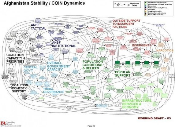
So let’s just take a break from the bloated graphs, nonsensical arrows, public bathroom human silhouettes, and never-ending pie charts! Oh, the pie charts! Yes, most consumers prefer visuals, but that’s because most consumers aren’t blind.
Stay In Touch.
Subscribe to our monthly email newsletter.