13 Tips for Website Accessibility

Most of us are familiar with the Americans with Disabilities Act of 1990, which prohibits discrimination based on disability. This civil rights law has far-reaching implications, including a requirement that all goods and services are accessible to people who have disabilities.
There is some question as to how or when the Department of Justice will impose regulations on website accessibility. The DOJ most recently withdrew proposed updates to the ADA in December 2017 that would have addressed website accessibility for people with disabilities.
With regulations in limbo, the rising number of lawsuits related to website accessibility are facing uncertainty as plaintiffs are unsure how to file claims and courts are unclear how they will proceed. What we can be certain of is that sites need to be accessible to everyone whether a suit is on the horizon or not.
At its core, accessibility is about creating a visitor-friendly environment for 100 percent of site visitors and customers. On a website, this means that all content can be read, all visuals can be seen, and all media can be viewed.
Fifty-three million American adults have a disability, and over half of them regularly use the Internet. Sooner or later, you’re going to have to prepare your site with the appropriate accommodations for all users.
Helpful Tips
Here are a few high-level points to take into consideration along with helpful links.
1. Responsive Design
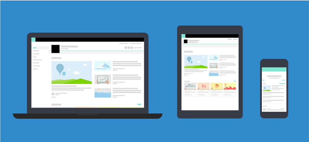
Most developers and designers know by now that websites need to be compatible with desktop and mobile viewing.
Even if you don’t have a professional designer to create your site, most website themes or designs are built “responsive,” meaning they automatically resize to be accessible and readable from a mobile device. Even so, it’s important to remind everyone that websites must be responsive in design for improved accessibility.
2. Interaction Methods
Some visitors are unable to use a mouse, keyboard, or their fingers (on mobile) when interacting with your website. Include text-to-speech options for users who are unable to physically interact with your site.
3. Text Resizing
For some visitors, their disability won’t be so severe that they can’t see your website at all; instead, they might not be able to see text if presented at too small a size.
Since oversized text has a tendency to look slopp in web design, your best bet here is to add a text resizing tool. so visitors can select how large they want the text on their screen to display.
Alternatively, make sure your website works at different browser zoom levels.
Source: Moz
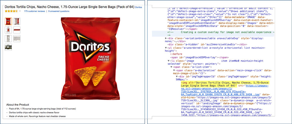
4. Alternative Text
For users having difficulty seeing images on your website, the alt text and caption fields are really important to use.
This way, they won’t need to see an image to understand what visual context you’ve paired with your text. Just enter a lengthy description about each image in the alt text and/or caption fields.
5. Transcripts
Videos, podcasts, and any other streaming or interactive media content (this includes media such as infographics) may also present obstacles for visitors.
For anyone who is hard-of-hearing, blind, or experiencing some other difficulty with consuming media, providing captions and transcripts are a must.
HELPFUL LINK: Transcripts: Speechpad
6. Simplified Messaging
It’s not a good idea to stuff your website with too much content. Attention spans are shrinking, so the last thing you want to do is force readers to scroll through 1,000-plus words of text on each page.
It’s also typically not a good idea to use industry-specific jargon or colloquialisms when writing for the web.The simpler the language, the better.
7. Text Organization
As part of the website (and design) simplification process, remember to use large and clear titles on top of every page. This will help in the readability of the page as well as navigation.
Within the body of text on each page, use obvious header titles, section breaks, and abundant white space so that visitors have a clear visual field to read from.

8. Text Color
While you might not think that using red hyperlink text is a bad idea — especially since you don’t see the competition doing it — it might be troublesome for visitors who are color blind.
Color can be tricky because of the psychological and emotional implications behind it, but the ability to see it can be problematic, too.
Find a color blindness website checking tool to ensure that all colors you use— from your logo to your images, as well as your plain text to the background contrast — will work for all users.
HELPFUL LINK: Color Blindness Simulator Tool

9. Directional Cues
For users with cognitive impairments or who just aren’t technologically savvy, it’s imperative to have directional cues available to help them along.
Tooltips is one such tool that can come to the rescue if a user gets stuck. For other users, it might be the little touches to design (like arrows in a slider or a call to action that actually looks like a clickable button) that help designate where the interactive elements of your site are.
10. Clear Navigation
A consistent and clear navigation is helpful for everyone who visits your site – including you. The last thing you want to do is bury hard-to-follow-but-extremely-important information in your site.
Make sure the navigation is easy to find and always accessible through the top of your site. Also make sure each label is clearly written in simple terms everyone will understand.
11. Internal Search
For some users, a navigation menu won’t be of much help. That’s why providing an internal search bar that’s ever present at the top of the site (or on relevant pages, like for e-commerce products) makes sense for many sites. Ideally, the search bar should come with voice search capabilities as well.
12. Form Directions
Contact forms are an essential part of every business’s website, whether they’re for newsletter signups, purchases, support requests, or any other function.
If you want to open the lines of communication to visitors, and with phone calls losing their viability with each passing day, a form is necessary. But for visitors who have comprehension issues, field labels can improve their ability to fill in the information they’re being asked for without issue.

13. Third-Party Partners
It’s imperative that all third- party partners used for tracking and data collection purposes agree that they are compliant in their methods and that the tags provided for such purposes are kept up to date with compliance.
Additionally, here are some other, lesser known tips from The U.S. Department of Health & Human Services (HHS) website which you can use to confirm your website meets all necessary requirements, including but not limited to:
- Provide a link to the homepage from every page on the website
- Conduct a 508 assessment to ensure your site is accessible to people using assistive technologies.
- Provide a user-friendly message for a 404 error page.
- Use standard colors for visited and unvisited links.
- Clearly and consistently distinguish required data entry fields from optional data entry fields when designing forms.
- Ensure that you have met all required accessibility policies for new media.
- Consult the HHS Research-Based Usability Guidelines when designing your website and consider conducting testing.
- Include audio descriptions and captions.
- Provide documents in an alternative text-based format, such as HTML or Rich Text Format.
These are some basic tips to get you started on your way to understanding what your site needs to do get up to speed for accessibility compliance.
Stay In Touch.
Subscribe to our monthly email newsletter.